


Iconography of digipaks
"Iconography is the visual images and symbols used in a work of art or the study or interpretation of these"
Each artists digipaks all contain their own icons depending on what genre they relate to. So for example you would not see a rock bands digipaks looking the same as indie folks due to them being associated with different colours, fonts and emotions.

Looking at the digipak by the band 'Accept' we can instantly see the genre it relates too through the use of its iconography and the style they have designed.
Looking at each of the band members outfits you can see they all relate and are coloured black and portray the 'punk rock biker' look. The use of the leather jackets and bandannas symbolise rock 'n' roll and darker type music.
The lighting is kept dark and very restricted as well as the background is just pure black again representing the 'darkness'. There is no other featured colours in the digipak.
However, looking at the artists name it has been enlarged so that it stands out more but also the colour is red and silver. It has a slight metallic look which could indicate the 'metal' style music.
Red is also associated with danger so their content may be risky and contain some strong language.
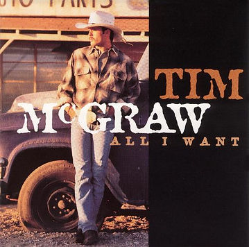
Looking at the digipak 'Tim McGraw' we can see he is a country style artist through the iconography. We can see he is dressed in a brown/white farmer styled shirt and blue jeans. His posture leaning up against the dusty truck in the back ground represents his attitude and music on the CD being strong country style. The overall style of the digipak has a dusky orange tint to it giving it a warm feel. Behind Tim is the front outline of a truck